Portfolio
Portfolio
A look at our clients and the designs that were created for them.
Sam Orgee Pools & Landscaping Ltd.
Website Design
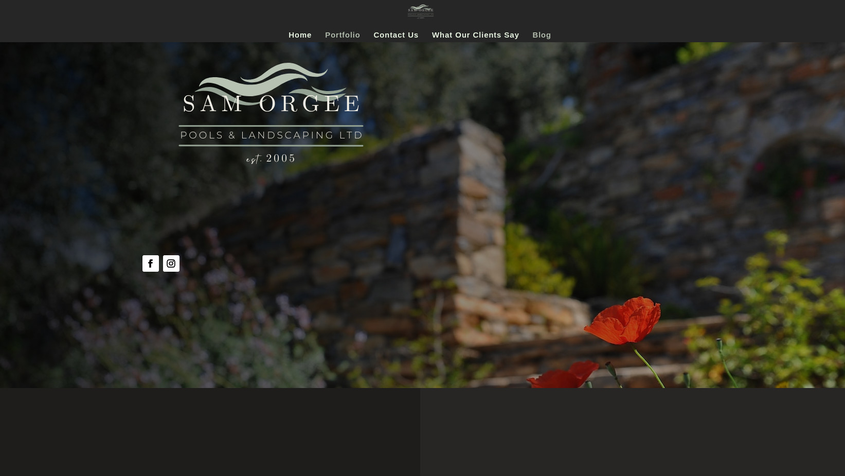
I had the pleasure of designing and developing a custom website for Sam Orgee, a premier provider of pool and landscaping services. The goal of the website was to highlight the company’s expertise in creating beautiful, functional outdoor spaces while offering a user-friendly experience for potential clients to explore services, browse galleries, and easily get in touch.
Key Features:
- Stunning Visuals: The website features a clean, modern design with high-quality images showcasing [Business Name]’s pool installations, landscaping projects, and outdoor living spaces.
- Service Pages: Clear, concise descriptions of services like pool design and installation, landscaping, hardscaping, and maintenance, allowing clients to quickly find the information they need.
- Responsive Design: Fully optimized for desktop, tablet, and mobile devices, ensuring a seamless experience across all platforms.
- Contact & Quote Forms: Easy-to-use contact forms for inquiries and requests, making it simple for visitors to get quotes or schedule consultations.
- Gallery Section: A visually engaging portfolio of completed projects, allowing visitors to view past work and inspire their own outdoor visions.
Curious & Crazy Facts
Logo & Banner Design
Project Overview:
This project involved designing a captivating logo and banner for a YouTube channel focused on creating informative and visually stunning documentaries about the animal kingdom. The channel aims to educate and entertain audiences by showcasing the beauty, behavior, and mysteries of wildlife across the globe. The branding needed to reflect the grandeur of nature and the diversity of the animal world while maintaining a professional and inviting feel.
Key Objectives:
- Brand Identity: The logo and banner needed to evoke a sense of wonder and respect for wildlife, while establishing the channel as a trusted source for high-quality documentaries.
- Visual Appeal: The design had to be bold, captivating, and instantly recognizable to stand out among other nature and documentary channels on YouTube.
- Cohesion Across Platforms: The designs were created to maintain a strong, consistent visual identity across YouTube, social media, and promotional materials.
Design Elements:
-
Logo Design:
- Iconography: The logo incorporated a stylized animal motif (such as an animal silhouette, paw print, or a globe) to symbolize the diversity of the animal kingdom and the channel’s documentary focus. This imagery was designed to be simple, yet memorable.
- Typography: The font was bold, elegant, and easy to read, ensuring it could stand out in YouTube thumbnails and across various screen sizes.
- Color Palette: Earthy tones such as greens, browns, and blues were used to reflect the natural world, complemented by subtle accents to add vibrancy and balance the logo’s aesthetic.
-
Banner Design:
- Visual Storytelling: The banner featured stunning wildlife photography or illustrations that immediately conveyed the channel’s focus on the animal kingdom. A balanced composition of animals from different ecosystems (e.g., forest, ocean, savanna) was used to highlight the diversity of the content.
- Tagline Integration: The channel’s tagline, such as “Exploring the Wonders of the Animal Kingdom,” was incorporated in the banner design, providing viewers with an immediate understanding of the channel’s mission.
- Layout & Design Elements: The banner was optimized for all screen sizes, with key elements like the logo and tagline positioned for maximum impact, while not obscuring important content or visual elements.
Perryfields Primary School
Website Redesign
Project Overview:
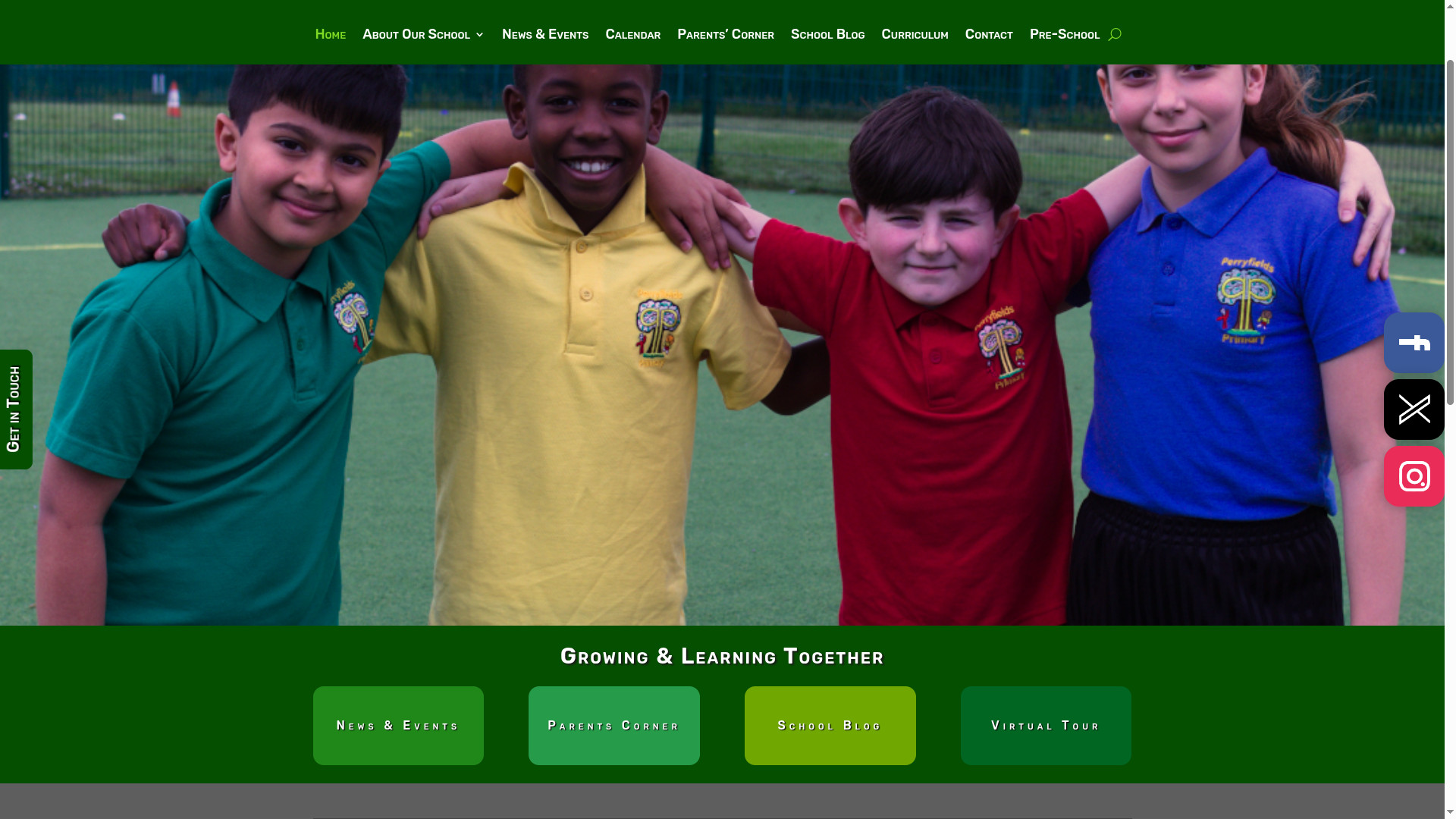
This project involved a complete redesign of the primary school’s website to enhance user experience, improve accessibility, and better reflect the school’s values and community. The new design aimed to provide a modern, engaging, and informative platform for parents, teachers, and students, making it easier to access important resources, news, and updates.
Key Objectives:
- User-Friendly Experience: The goal was to create a clean, intuitive, and easily navigable website that would cater to the needs of parents, students, and staff. A focus on accessibility and mobile responsiveness ensured that the website could be used by everyone, whether at home or on-the-go.
- Visual Appeal: The design needed to capture the welcoming and nurturing spirit of the school, using a color palette and imagery that would resonate with both children and adults, while also conveying the school’s academic focus.
- Content Organization: The new layout needed to prioritize essential content, such as school news, calendars, class resources, and important updates, making it easy for visitors to find the information they need quickly.
Design Elements:
- Modern, Bright Aesthetic: The website featured a bright, colorful design with a balance of engaging visuals and professional typography. Images of students, teachers, and the school environment were integrated to create a warm, community-focused atmosphere.
- Intuitive Navigation: Key sections such as “About Us,” “Admissions,” “Parent Resources,” “News & Events,” and “Contact Information” were prominently featured in a user-friendly navigation menu. Each page was clearly organized, allowing for a smooth browsing experience.
- Responsive & Mobile-Friendly: The website was fully responsive, ensuring it looked and functioned beautifully across all devices, from desktops to smartphones, which is essential for busy parents and teachers on-the-go.
- Integration of Interactive Features: The redesign included an interactive calendar to keep parents updated on school events, and a news section for announcements and achievements. A secure, easy-to-use portal for parents and students was also added for quick access to academic resources and class information.
iHasHorns Gaming
Logo & Banner Design
I had the exciting opportunity to design a custom logo and banner for iHasHorns gaming. a channel dedicated to celebrating the golden era of gaming. The goal was to create a nostalgic yet modern aesthetic that resonates with fans of retro games, while also making the channel visually appealing and easily recognizable on YouTube.
Key Features:
- Logo Design: The logo features iconic elements of retro gaming, such as pixel art, vibrant colors, and nostalgic typography, capturing the essence of classic games while giving it a fresh, dynamic look for modern audiences.
- Banner Design: The banner showcases a vibrant, action-packed scene inspired by retro gaming landscapes, incorporating elements like arcade machines, 8-bit characters, and vintage game controllers. The design is both eye-catching and informative, with space for social media links and channel branding.
- Brand Cohesion: The logo and banner were designed to work seamlessly together, creating a consistent and cohesive brand identity across all of the channel’s content. The designs evoke the spirit of nostalgia while appealing to a new generation of retro gaming enthusiasts.
Kal-El’s Toys & Games
Logo & Banner Design
Project Overview:
This project involved creating a playful, vibrant logo and banner for a YouTube channel dedicated to kids’ gaming. The channel is focused on providing family-friendly gaming content, from game tutorials to fun playthroughs, all designed to engage young audiences. The branding needed to be fun, energetic, and appealing to children while ensuring the channel’s identity stands out among the many other gaming channels on YouTube.
Key Objectives:
- Engaging Design: The logo and banner needed to instantly capture the attention of kids and parents alike, creating a sense of excitement and fun around the gaming content.
- Child-Friendly Theme: The design had to be appropriate for a younger audience, with bright colours, fun graphics, and playful typography that would resonate with children.
- Brand Recognition: The branding should be memorable, with a unique identity that could be easily recognized across YouTube, social media, and future merchandise.
Design Elements:
-
Logo Design:
- Iconography: The logo featured gaming-related icons (such as game controllers, joysticks, or pixel art) blended with friendly, whimsical elements like cute characters or mascots to appeal to younger viewers.
- Typography: The font used in the logo was bold, rounded, and playful, ensuring it was easy to read and visually fun. The letters were designed with a youthful flair, keeping the overall aesthetic approachable and cheerful.
- Colour Palette: Bright, energetic colours like neon greens, blues, and yellows were chosen to grab attention and reflect the fun, vibrant nature of kids’ gaming.
-
Banner Design:
- Fun & Dynamic Visuals: The banner was designed with dynamic, action-packed graphics showcasing scenes from popular kid-friendly games or animated characters in gaming settings, drawing in the audience with colorful imagery.
- Tagline & Content Highlights: The channel’s tagline (e.g., “Fun Adventures in Gaming!”) was integrated into the banner, along with visual cues like gaming avatars or in-game icons, emphasizing the channel’s fun and interactive vibe.
- Optimized Layout: The banner was optimized for YouTube’s various screen sizes (desktop, mobile, TV), ensuring that key elements like the logo, tagline, and action scenes were visible and balanced across all devices.
Stella Maffeis Photography
Logo & Website Design
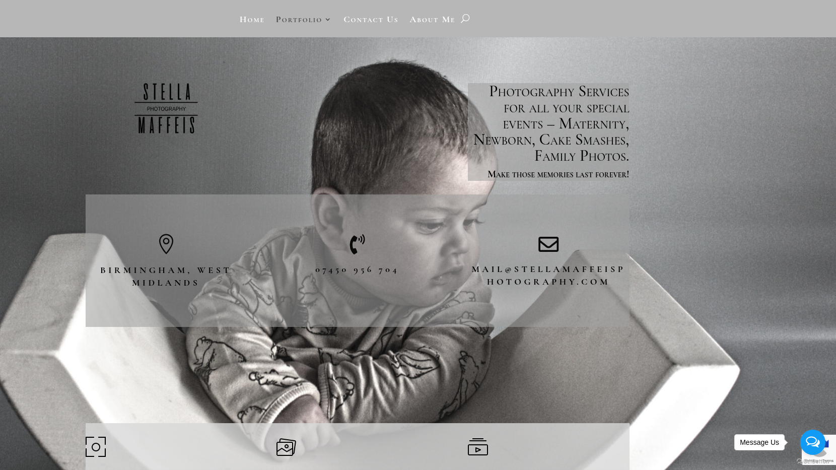
Designed and developed a sleek, visually striking website for a professional photographer, serving as both a portfolio showcase and a point of contact for potential clients. Key features include:
- Portfolio Gallery – A curated display of high-quality images, organized by category (e.g., portraits, landscapes, events).
- About Page – Highlighting the photographer’s background, style, and artistic approach.
- Contact & Booking Form – Streamlined inquiries and booking requests for client convenience.
- Responsive Design – Optimized for seamless viewing across desktops, tablets, and mobile devices.
- SEO Optimization – Enhanced visibility in search results to attract more clients.
This project provided a professional and visually compelling online presence, making it easier for clients to explore the photographer’s work and connect for bookings.
Why I Love Buffy
Logo & Website Design
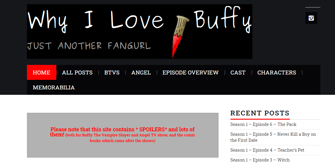
Designed a captivating logo and website for a fan blog dedicated to Buffy the Vampire Slayer, creating a visually engaging and immersive experience for fans. The project included:
- Website Development – A sleek, easy-to-navigate platform featuring:
- Episode Recaps – Detailed breakdowns of each episode.
- Screenshot Gallery – High-quality images from the show.
- Downloadable Sound Clips – Iconic one-liners and memorable quotes.
Spots and Stripes Unlimited
Implementation of new Website
Project Overview:
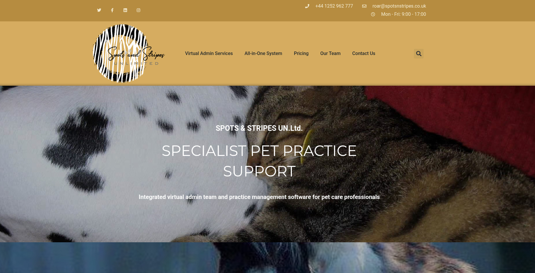
This project involved assisting with the implementation of a new website for a company that offers virtual administrative services, with a specialization in the animal care sector. The goal was to create a streamlined, professional, and user-friendly online presence to help the business reach animal care professionals seeking efficient administrative support. The new CMS system was chosen to improve content management, ease of use, and scalability for the company as it grows.
Key Objectives:
- Smooth CMS Transition: Assisted with the migration of the website to a new, more flexible CMS platform that supports easy content updates, integrates with other tools, and provides a user-friendly backend interface.
- Target Audience Focus: Developed the website to resonate with the target audience—animal care professionals—including veterinarians, pet groomers, animal shelters, and other businesses in need of virtual admin support.
- Enhanced Service Presentation: Ensured the website clearly conveyed the range of services offered, such as scheduling, client management, invoicing, and other virtual administrative tasks tailored to the unique needs of the animal care industry.
- Efficient Contact & Booking System: Integrated an intuitive contact form and online booking system to allow clients to quickly inquire about services or schedule consultations.
Features & Functionalities:
- Service-Centric Design: Created pages dedicated to specific services offered, each highlighting how virtual admin support can improve efficiency and reduce workload in animal care businesses.
- SEO & Performance Optimization: Ensured SEO best practices were followed to help the website rank well for relevant keywords in the animal care and virtual admin sectors, and optimized for fast page loads.
- Client Testimonials & Case Studies: Incorporated a section for client testimonials and success stories, showcasing the effectiveness of virtual admin services in the animal care industry.
- CMS Training & Support: Provided the company with training on the new CMS platform, ensuring they could independently manage and update the website content moving forward.
Crafty Mamma Tips
Logo design
Project Overview:
This project involved designing and developing a vibrant and engaging mummy blog dedicated to creative craft ideas and activities for young children. The goal was to create a resourceful platform for parents seeking easy, fun, and educational craft ideas to do with their little ones. The blog was designed with a focus on fostering creativity, learning, and quality bonding time between parents and children.
Key Objectives:
- User-Friendly Design: The blog needed to be easy to navigate, with an intuitive layout and clear categories, making it simple for parents to find craft ideas by theme, age, or material.
- Inspiring Content: The blog was built to inspire and empower parents with a wide variety of craft projects, from simple DIY crafts to more elaborate creations, tailored to suit young children’s developmental stages.
- Visual Appeal: The design incorporated bright, cheerful colours and playful elements to reflect the fun and creative nature of the blog’s content, making it visually appealing for both parents and kids.
- Responsive & Accessible: The blog was created to be fully responsive and mobile-friendly, ensuring it could be accessed easily on any device, whether at home or on the go.
Features & Functionalities:
- Categorized Craft Ideas: Craft projects are categorized by age group, materials, and themes (seasonal, holidays, educational, etc.), allowing for easy navigation and quick access to relevant ideas.
- Step-by-Step Guides: Each blog post features clear, easy-to-follow instructions, often with photos or videos, so parents can confidently complete the crafts with their kids.
- Resource Lists: Helpful resources, including free printables, templates, and downloadable guides, are offered to support the craft activities.
- Engagement Tools: The blog includes interactive elements such as comment sections, social media sharing options, and newsletter signup, allowing parents to share their experiences and stay updated on new craft ideas.
Second Nature Animal Behaviour Counselling
Migration to a New CMS Platform
Project Overview:
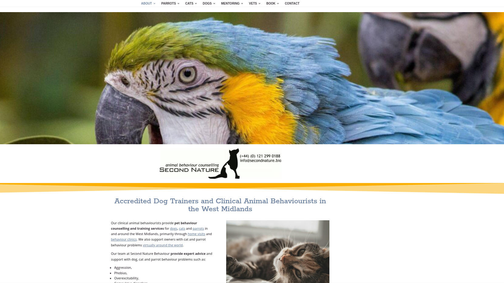
This project involved migrating an established animal behaviour counselling website to a more user-friendly and flexible content management system (CMS). The goal was to enhance the website’s performance, streamline content management, and provide a seamless user experience for both clients and the service team.
Key Objectives:
- Improved User Experience (UX): The new CMS platform offers a more intuitive interface for potential clients, with easy navigation and better accessibility on mobile devices.
- Efficient Content Management: Transitioned from an outdated CMS to a more modern platform, making it easier for the client to update content, manage bookings, and interact with visitors.
- Enhanced Design & Branding: The redesign of the website incorporated modern, clean design elements, ensuring it reflects the caring and professional nature of the counseling services offered.
- SEO & Performance Optimization: The website was optimized for search engines to ensure higher visibility in search results, with a focus on improving page load speed and overall performance.
Features & Functionalities:
- Online Appointment Booking: Integration of an easy-to-use booking system, allowing clients to schedule sessions quickly and efficiently.
- Responsive Design: The website is fully responsive, ensuring that it performs beautifully across all devices—desktop, tablet, and mobile.
- Content Migration: Successfully transferred all existing content, including service descriptions, blog posts, testimonials, and client resources, to the new platform.
- SEO & Analytics: Ensured SEO best practices were followed during the migration, with Google Analytics integration to track website performance and client engagement.
- Client Engagement Tools: Added features like contact forms, educational resources, and FAQs to increase client interaction and satisfaction.
NoobVault
Logo & Banner Design
Project Overview:
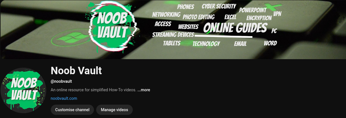
This project involved designing a dynamic logo and banner for a YouTube channel dedicated to providing in-depth, easy-to-follow technical how-to guides. The client wanted the branding to reflect the channel’s focus on simplifying complex technical topics and helping users solve problems with clear, step-by-step instructions.
Key Objectives:
- Brand Identity: The goal was to create a memorable and professional visual identity that would stand out on YouTube and resonate with tech enthusiasts and beginners alike.
- Visual Appeal: The logo and banner needed to effectively communicate the channel’s technical focus while being accessible and engaging to a broad audience.
- Versatility: The designs needed to work seamlessly across various platforms, from YouTube and social media to merchandise and promotional materials.
Design Elements:
-
Logo Design:
- Iconography: The logo incorporated technical symbols (like gears, circuit lines, or simplified tech tools) to reflect the “how-to” nature of the content.
- Typography: A modern and clean font was chosen for the logo to ensure readability, paired with tech-inspired elements to reinforce the technical theme.
- Colour Palette: A bold and tech-savvy colour scheme, using shades of blue, black, and silver, was chosen to convey trust, professionalism, and modernity, while also standing out on the YouTube platform.
-
Banner Design:
- Visual Flow: The banner design included key elements like the logo, the channel’s tagline (e.g., “Simplifying Tech, One Guide at a Time”), and visual icons representing different technical topics (e.g., coding, hardware, software).
- Layout: The banner was designed to be visually appealing across various screen sizes, with attention to how it would appear on desktop, mobile, and TV views.
- Typography & Branding: The font and style from the logo were carried over into the banner for cohesive branding, with a layout that directs viewers’ attention to the call-to-action (e.g., “Subscribe” or “Watch Now”).
The Gift of Chilli
Logo Design
Project Overview:
This project involved creating a bold and memorable logo for a chili enthusiast brand, designed to capture the fiery passion and spice-loving nature of the target audience. The client wanted a logo that would reflect their deep love for all things chilli—from the heat to the flavour—while maintaining a fun, approachable vibe.
Key Objectives:
- Brand Identity: The goal was to create a unique and recognizable logo that could easily be associated with the chilli enthusiast community, reflecting both the fiery intensity of chilli peppers and the fun, adventurous spirit of the brand.
- Creative Expression: The logo needed to strike a balance between being eye-catching and playful, while also conveying the heat and excitement associated with chili and spicy foods.
- Versatility: The logo was designed to be versatile, ensuring it could work across various mediums, from merchandise and packaging to social media and marketing materials.
Design Elements:
- Chili Iconography: Incorporating a stylized chilli pepper into the design, the logo emphasizes the central theme of heat, spice, and flavour, while also using bold colours like red, orange, and green to evoke the vibrant and fiery nature of chilli peppers.
- Typography: The font chosen for the logo is dynamic and bold, matching the intensity of the chilli theme, with a touch of fun to make the brand feel approachable.
- Colour Palette: The use of hot, vibrant colors—specifically shades of red, yellow, and green—reinforces the heat of chilli peppers, while providing a visually exciting and energetic feel.
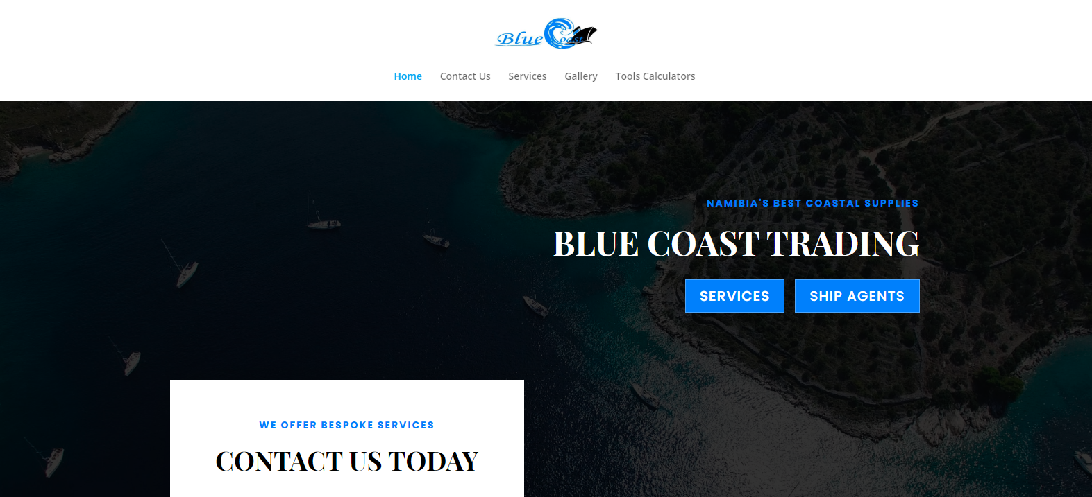
Blue Coast Trading
Website Design
Developed a professional and user-friendly website for an Imports & Exports company based in Southern Africa, showcasing their services and enhancing their online presence. The website includes:
- Service Pages – Clearly outlining freight forwarding, customs clearance, and warehousing solutions.
- Contact Forms – Custom-built inquiry forms for easy client communication and quote requests.
- Image Gallery – Featuring high-quality visuals of logistics operations, enhancing credibility.
- SEO Optimization – Implemented best practices to improve search visibility and reach.
- Mobile Responsiveness – Ensured seamless performance across all devices.
